CASE STUDY
JERRY CANTRELL
I WANT BLOOD
PHOTOGRAPHY BY DARREN CRAIG
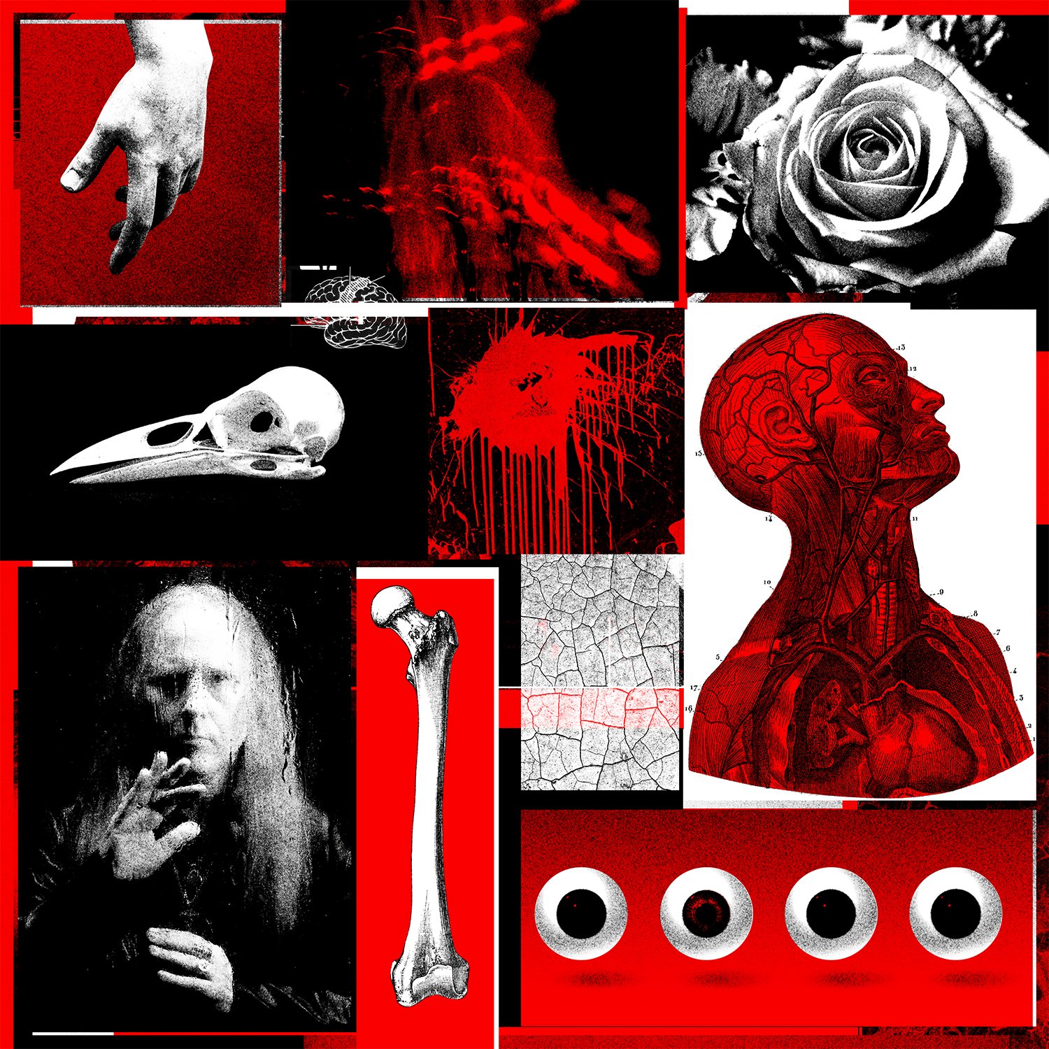
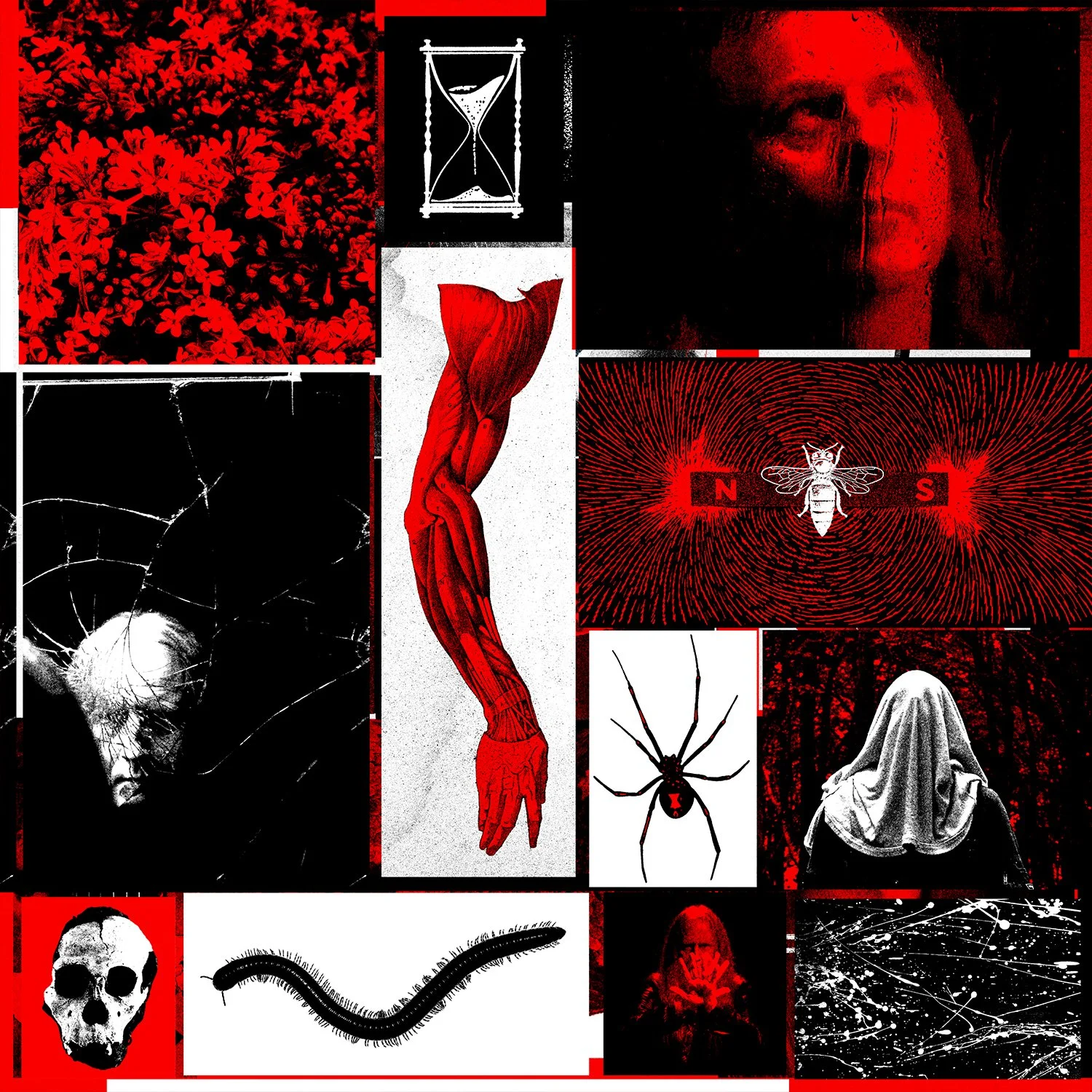
There were many ideas discussed throughout the concept phase of Jerry Cantrell’s fourth solo album, I Want Blood. The only bit of initial direction I remember was—that if the album title did end up being I Want Blood—no literal depiction of blood be on the artwork. So much for our first dozen or so ideas.
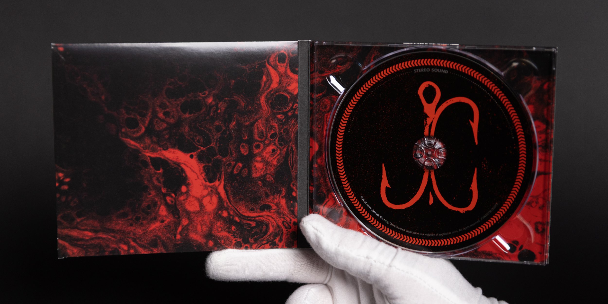
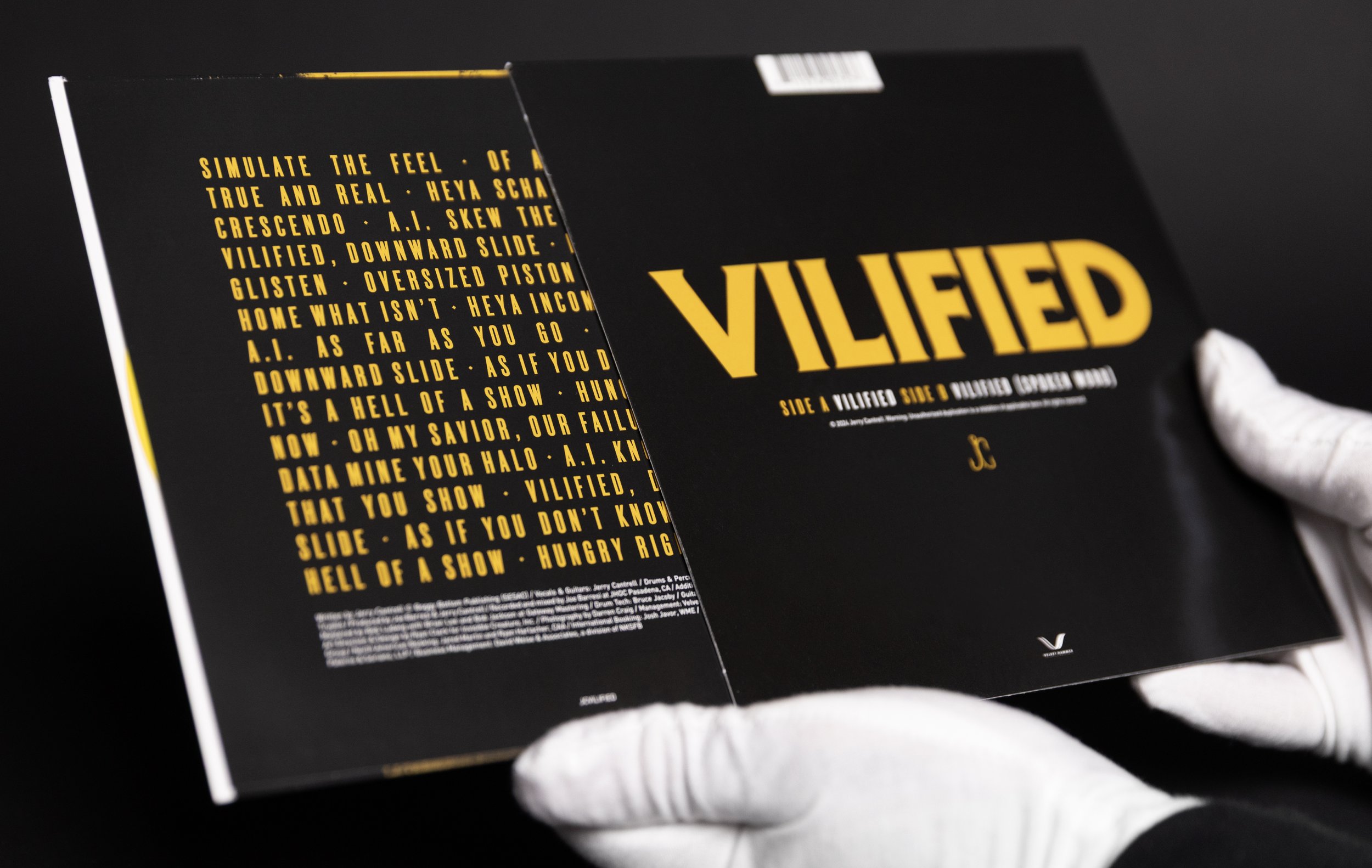
One early conversation revolved around the concept of a treble hook. An idea struck me immediately, which was to manipulate the shape of the hook just slightly enough to read “JC." Though the fish hook icon didn’t end up as the album cover per se, it served as a nice piece of supplementary design to accompany type treatments and the like.
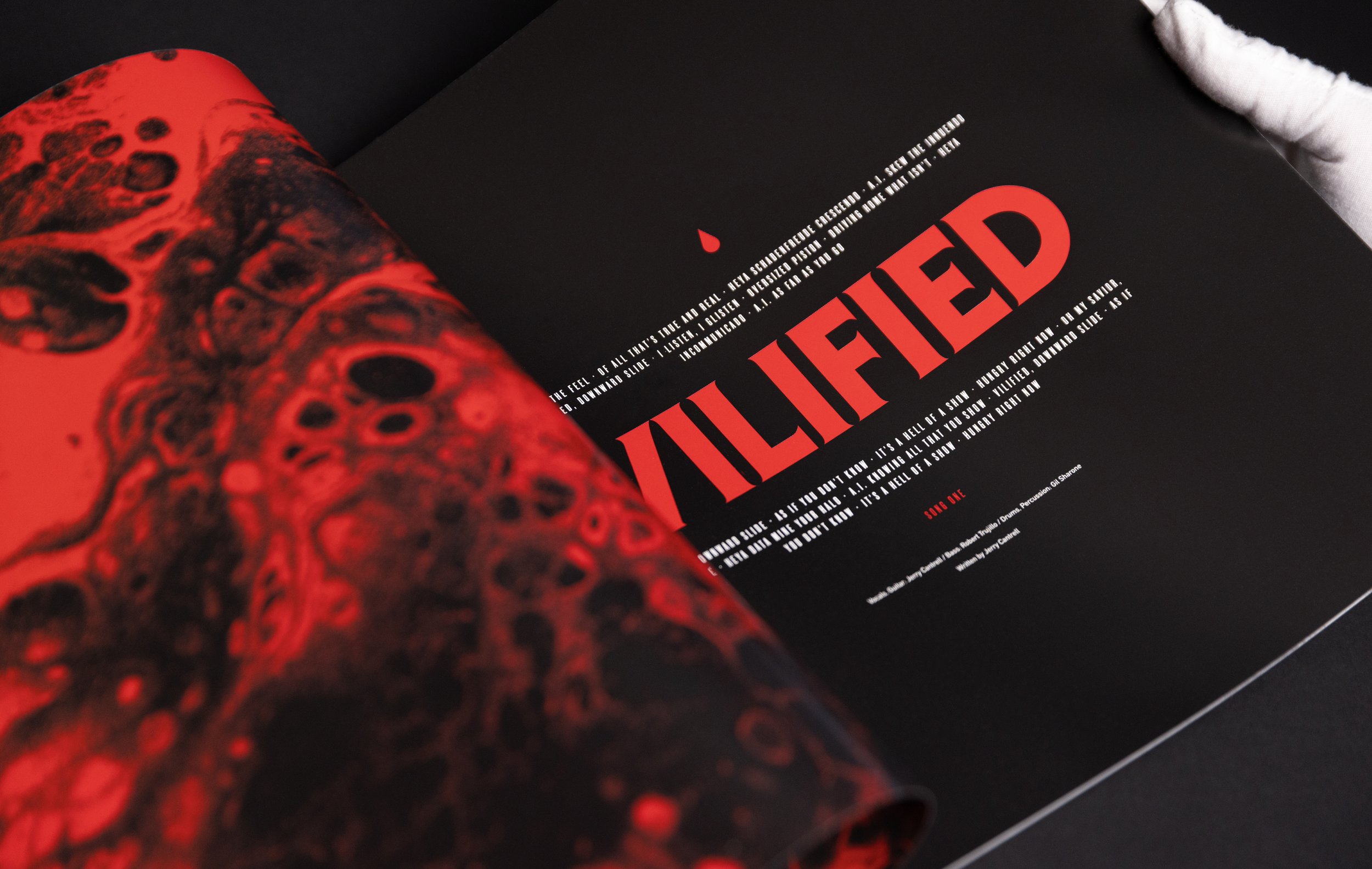
Since the album title struck like a movie title of sorts, the vision of big, bold type was unshakeable. The album’s title treatment was one of the first concepts to be designed, and the first to be approved.
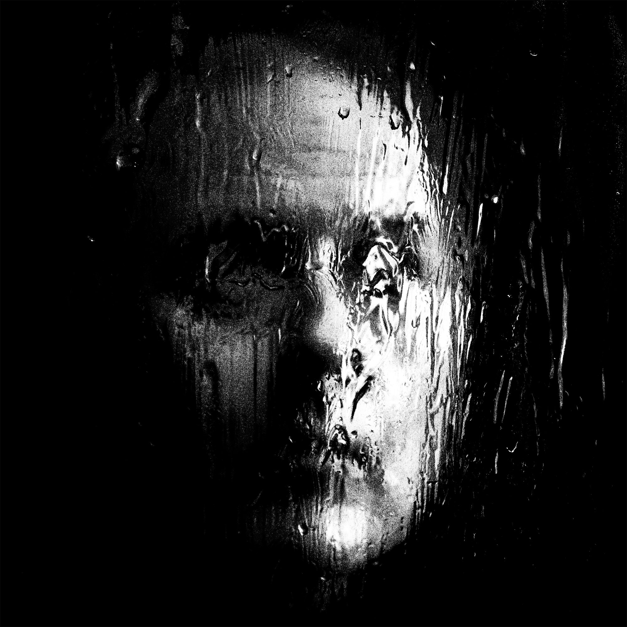
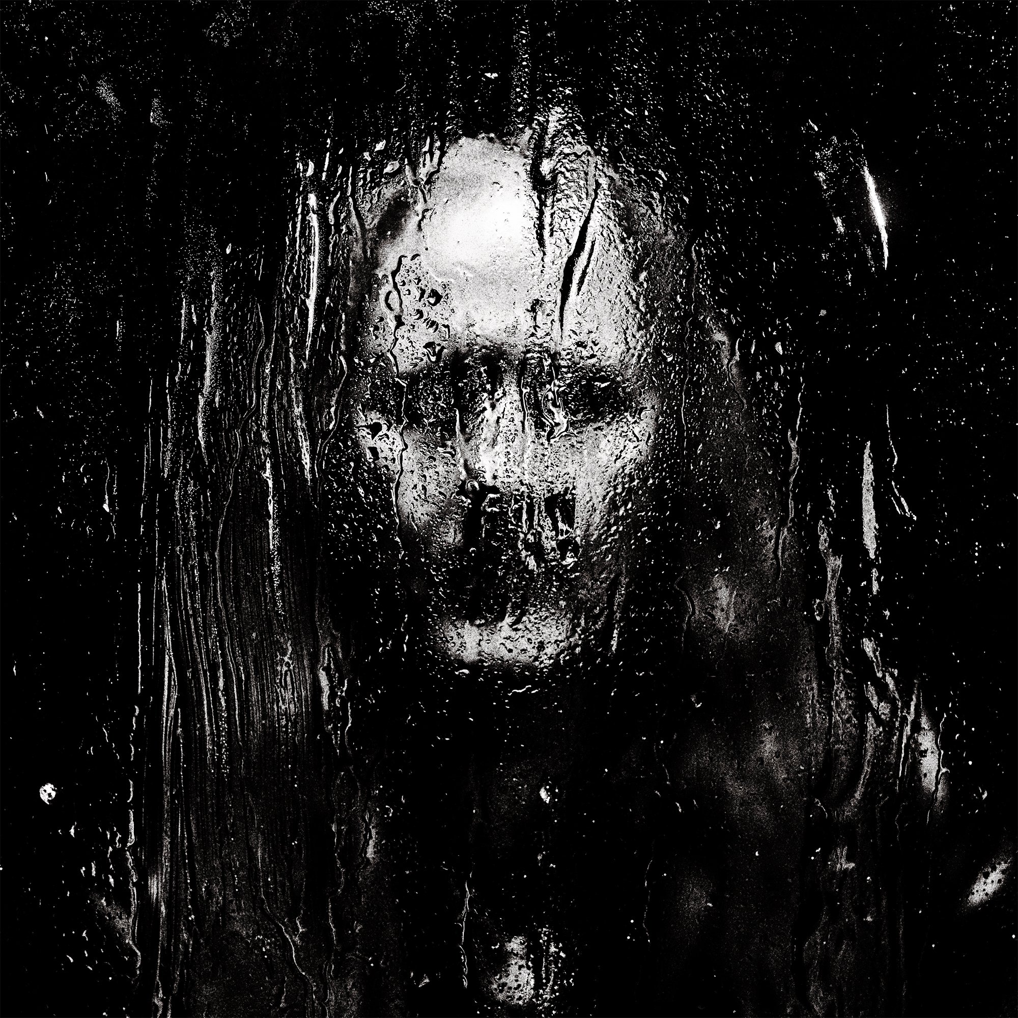
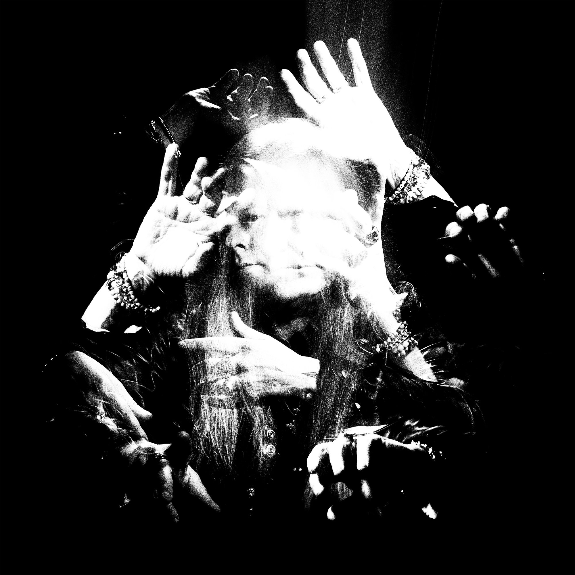
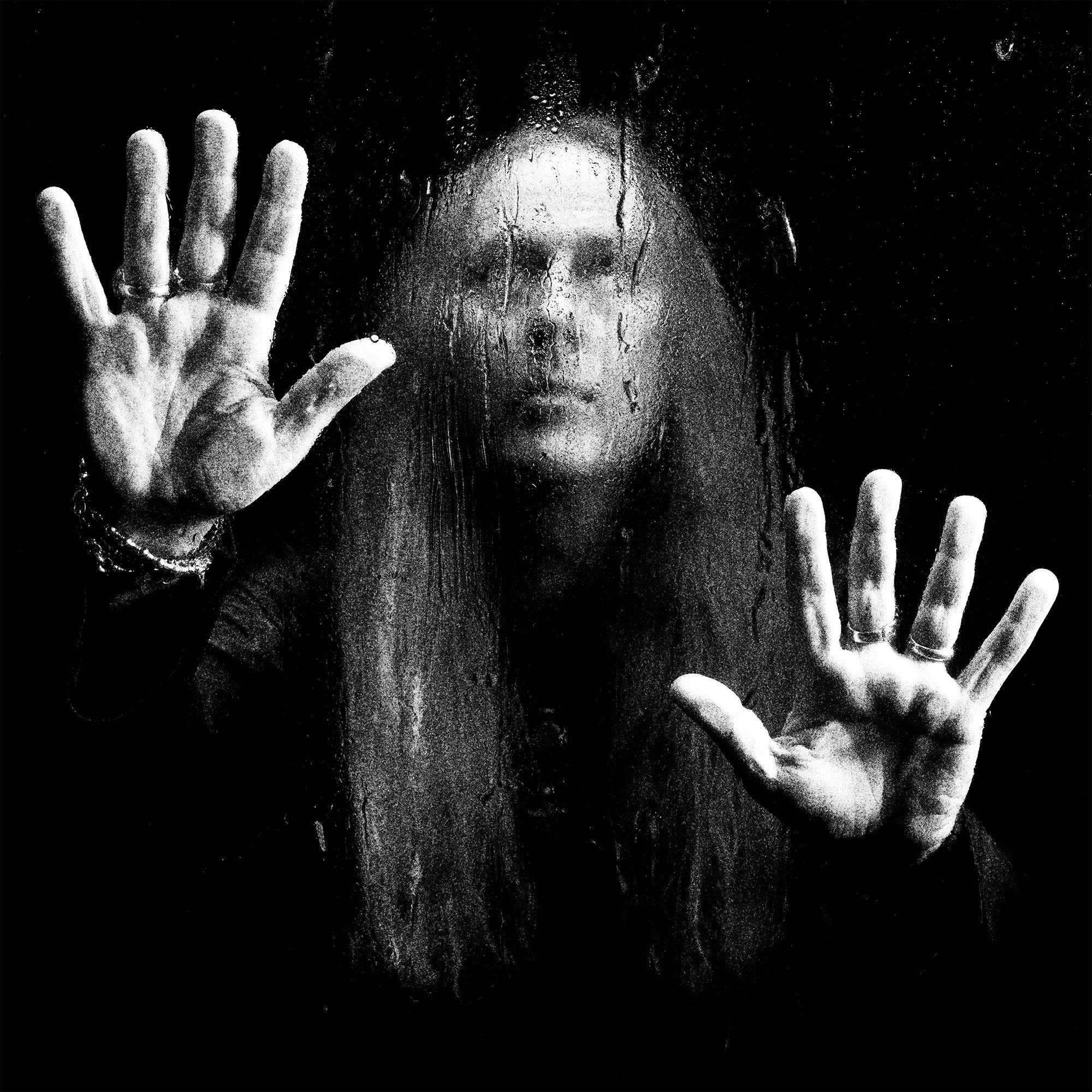
As the smaller details began taking shape, the final piece was to glue them all together with strong imagery. We knew we wanted this artwork to land somewhere in the photographic realm. Coming off the heels of Jerry’s third album, Brighten, which prominently featured detailed illustrations, it was our hope to enter into a completely new aesthetic territory. Eventually we agreed on the plan to photograph Jerry in a variety of setups and see what sorts of madness would shake out. I enlisted the talents of Darren Craig—a great old friend with a keen eye for dark and gritty (yet sophisticated) music photography.
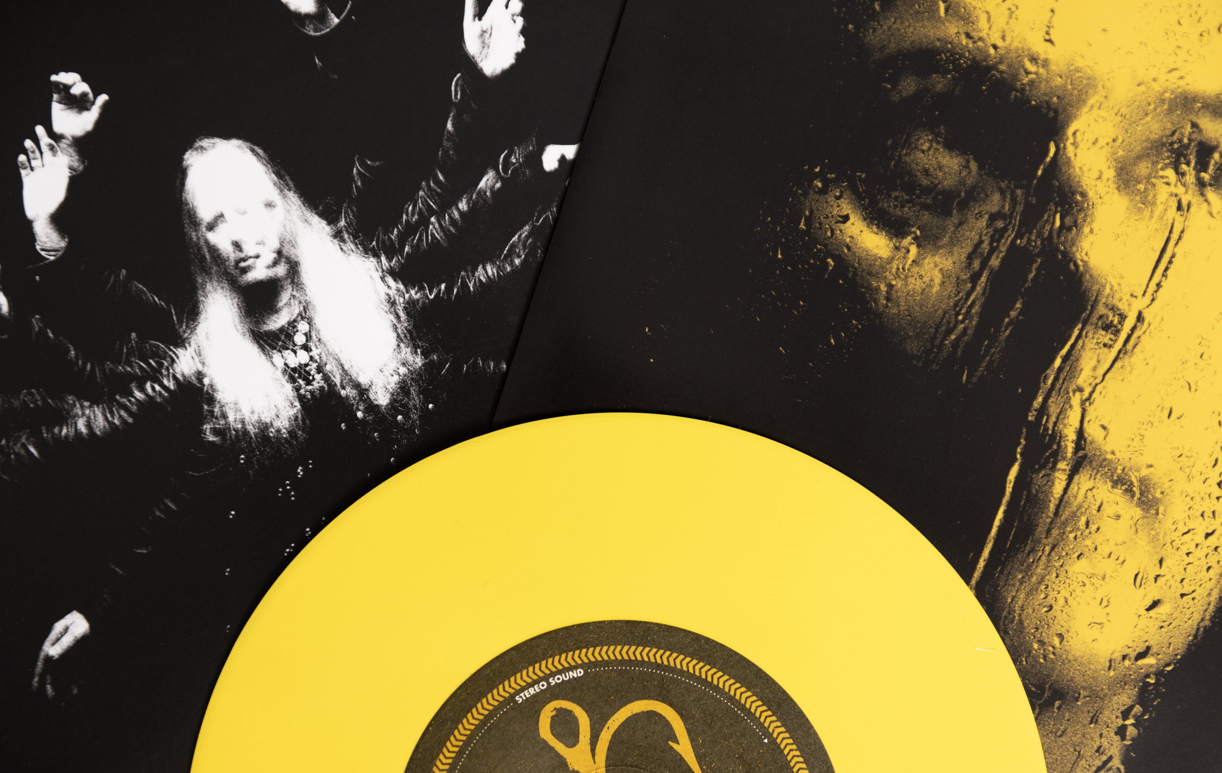
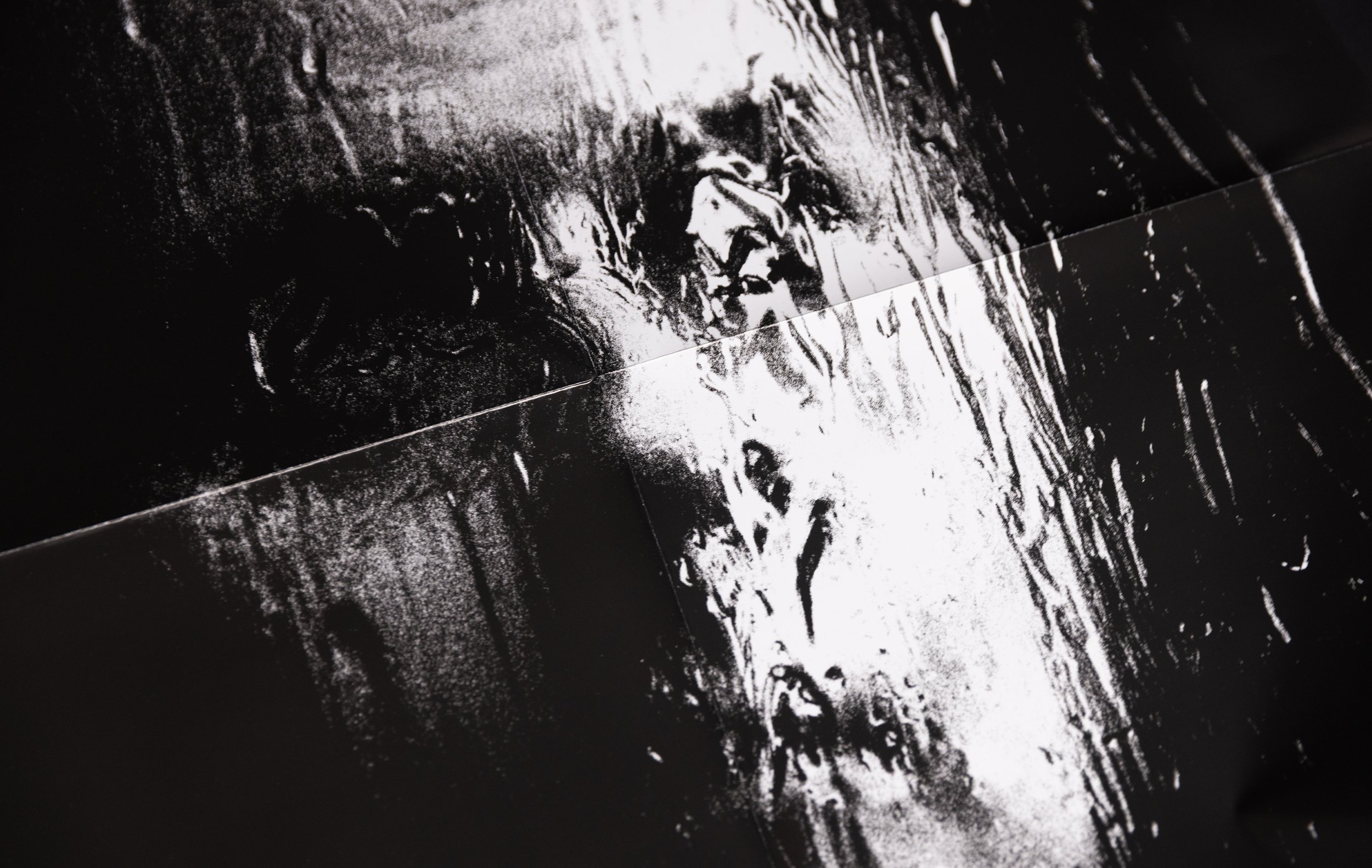
The cover itself was one of many shots photographed through a pane of glass covered in Vaseline and water. The liquid texture warped Jerry’s face in cool and unpredictable ways, making for a handful of very haunting images.
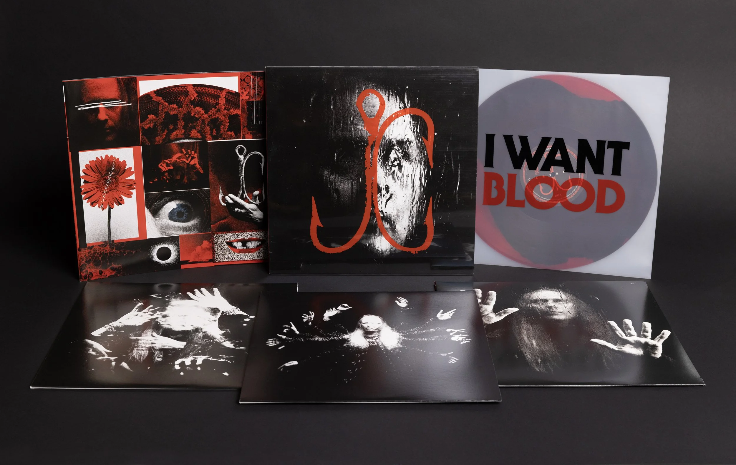
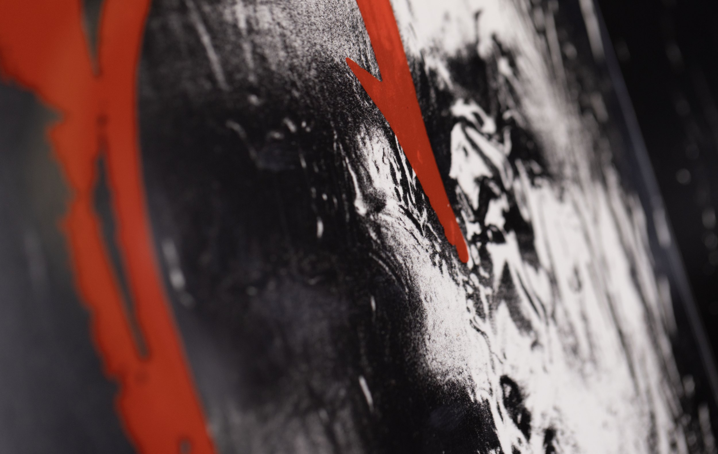
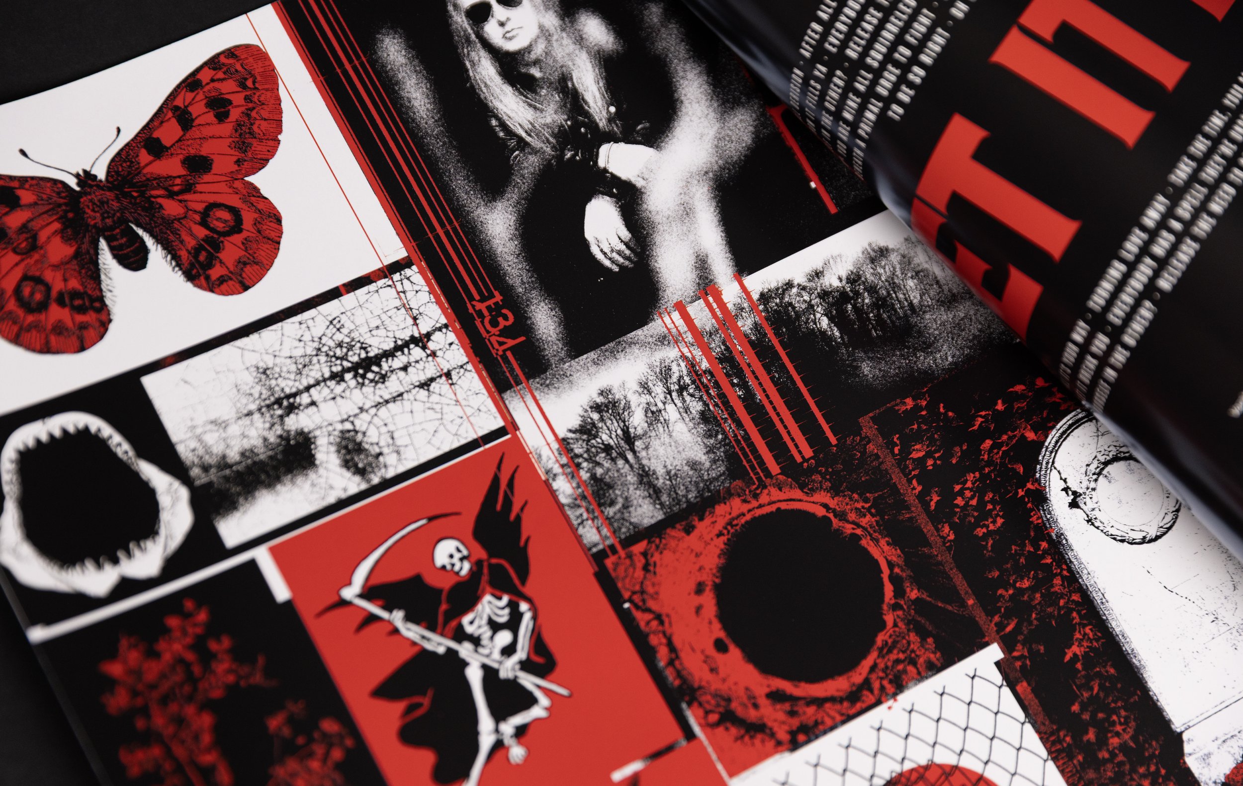
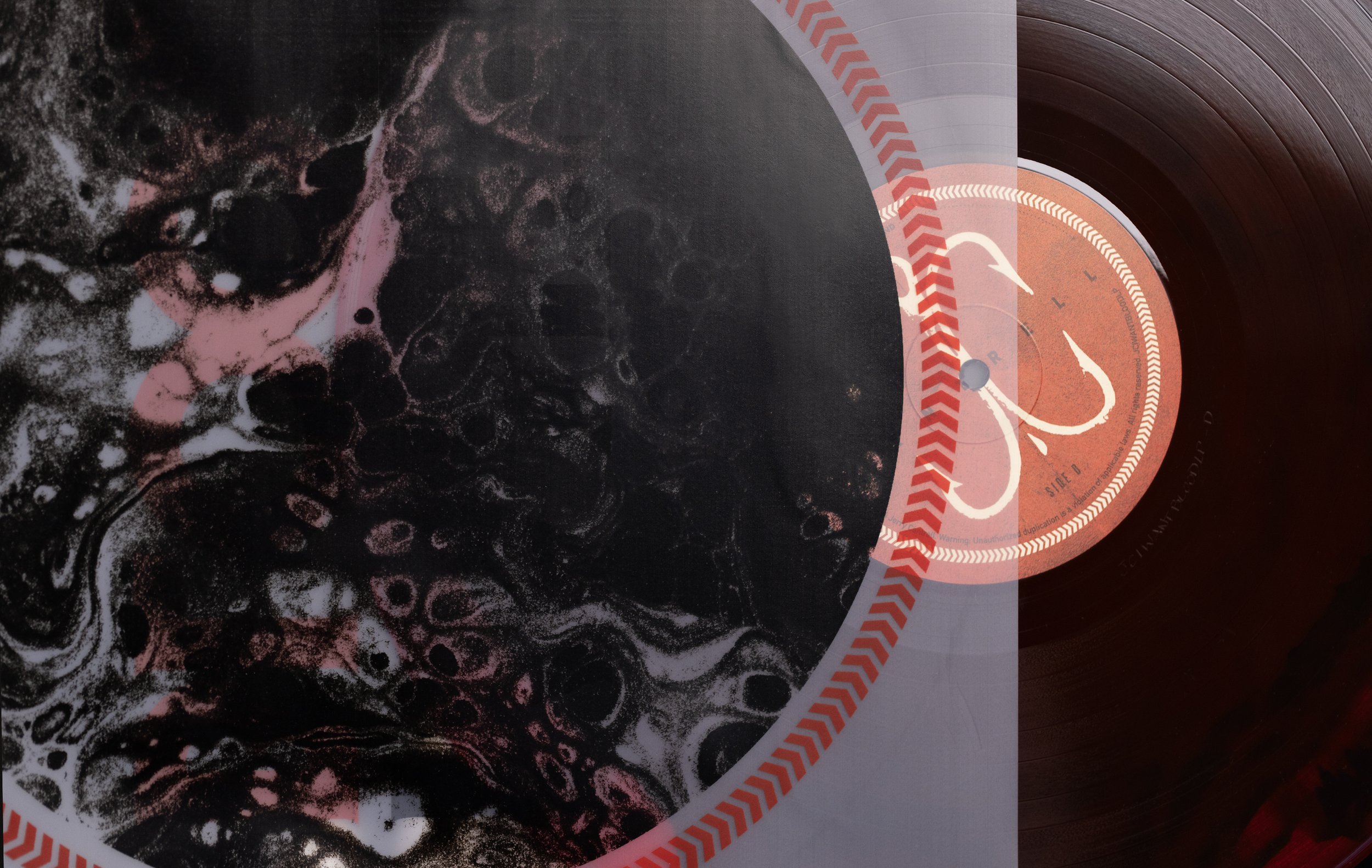
We fleshed out the album campaign with a number of vinyl variants, CD format, branding package, tour admats, print ads, staging assets, and more.