CASE STUDY
SPIRITBOX
ETERNAL BLUE
ART DIRECTION & DESIGN BY KEVIN MOORE
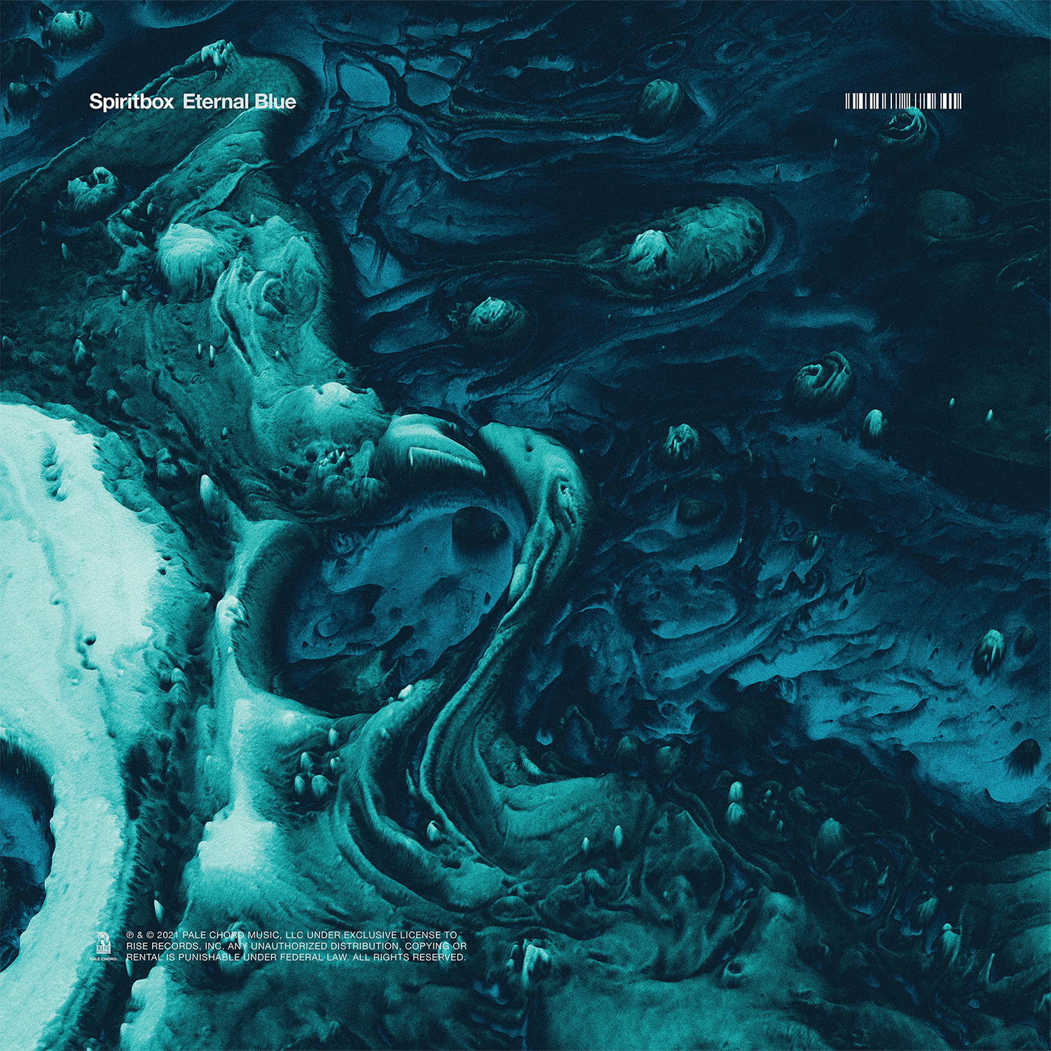
At this point in time, Spiritbox’s rise to acclaim was something of a freight train. In what seemed like mere months they would become one of the biggest names in heavy music. The momentum behind the band was undeniable, and the artwork for Eternal Blue had to match the level of dedication and precision that Mike and Courtney poured into every track on the record.
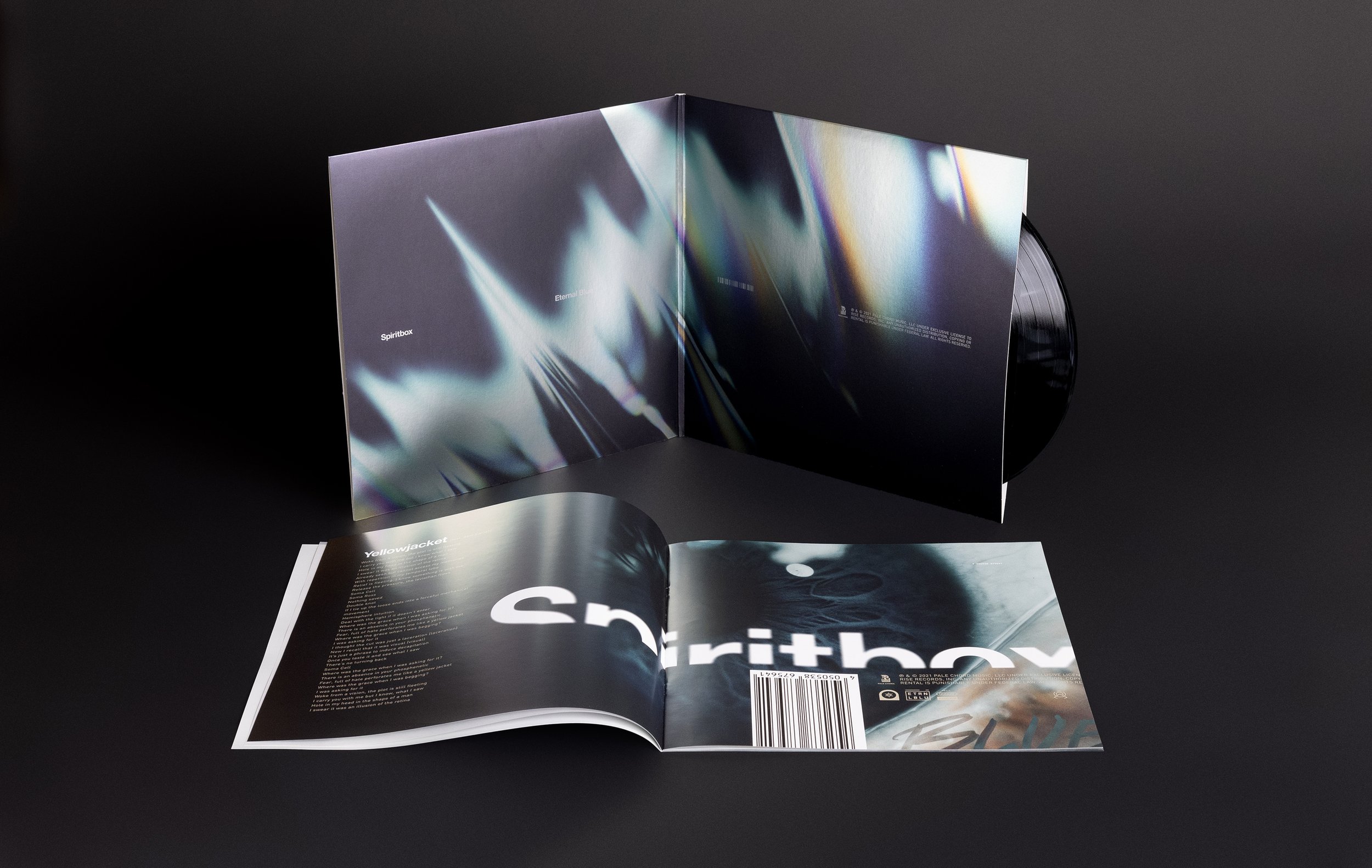
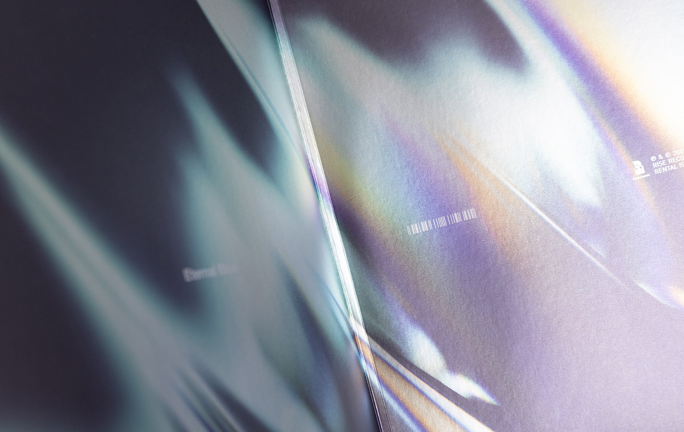
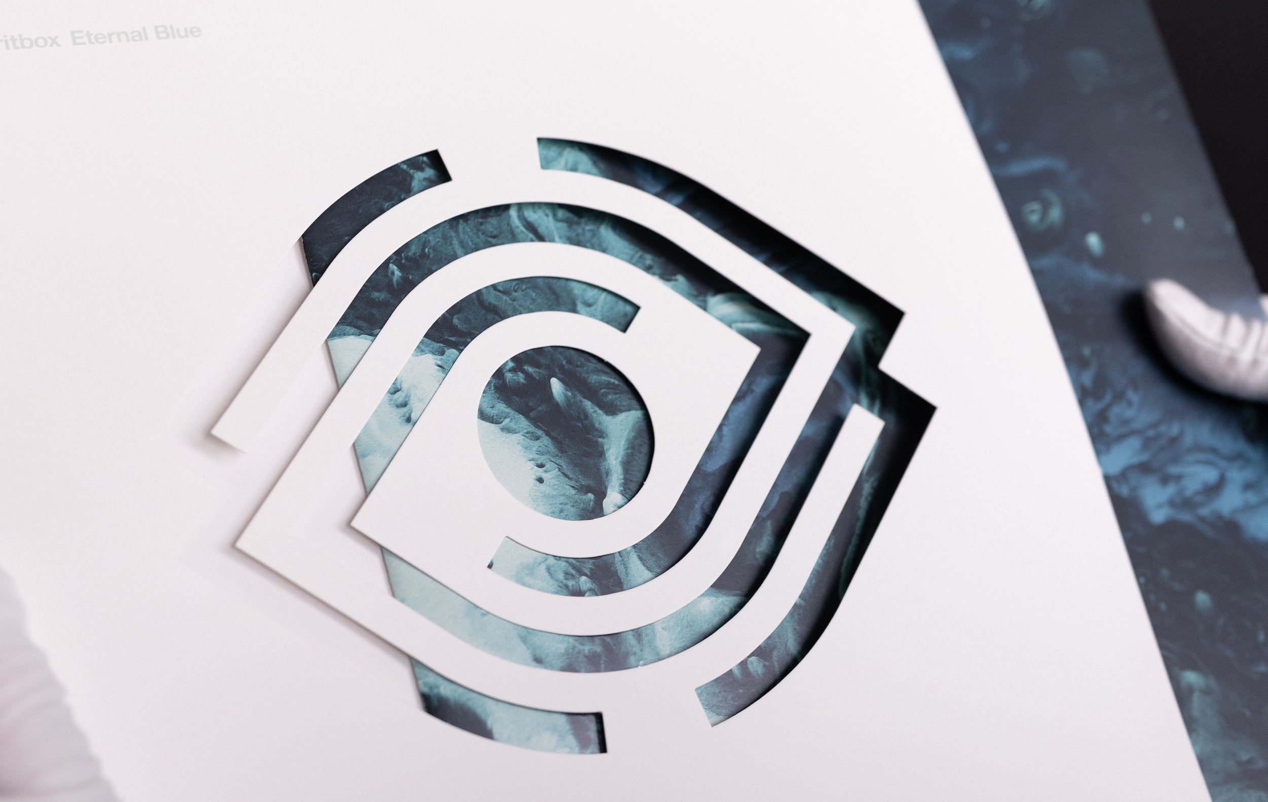
We decided to pull out all the stops for the packaging: Die cuts, spot colors, vellum stock, and metallic finishes would all play a role in elevating the album's physical presentation. Designing with these premium elements in mind was both a challenge and a thrill.
Our hope was to approach this project with the same intensity Spiritbox brings to their music. Every detail was carefully considered to ensure that the visuals resonated with the artistry, emotion, and technicality of the album. The end result is a package as bold and dynamic as the record contained within—a true reflection of the band's vision.